
The map
The map shows every type at once, wherever each item is now, and moves things as they’re updated. Use the sidebar’s tabs to hide a type you don’t need.
Each type has its own shape, coloured by the item’s status as its list row is:
| Type | Shape |
|---|---|
| Vehicles | A teardrop pointing the way the vehicle is heading, with a car inside, or a box for a tracker that isn’t linked to a vehicle record |
| External vehicles | A teardrop with an outlined car |
| People | A circle |
| Incidents | A square with the incident’s grade |
| Alerts | An amber diamond |
| Events | A red-edged warning triangle, on the line of the route the vehicle took |
| Locations | The area’s outline, with a house icon in it |
| Objectives | The area’s outline, with a hexagon icon in it |
| Scenes | A dashed outline, like cordon tape, coloured by attendance |
Incidents are drawn on top of everything else, then events, then people and radios, then vehicles and trackers, with areas underneath. Within a type, more urgent statuses are drawn on top. People in an emergency, for example, appear above other people.
Stale items, when shown, are grey. Items that don’t match your filters, when shown, are faded. See Stale items and Show filtered out.
Groups of icons
Section titled “Groups of icons”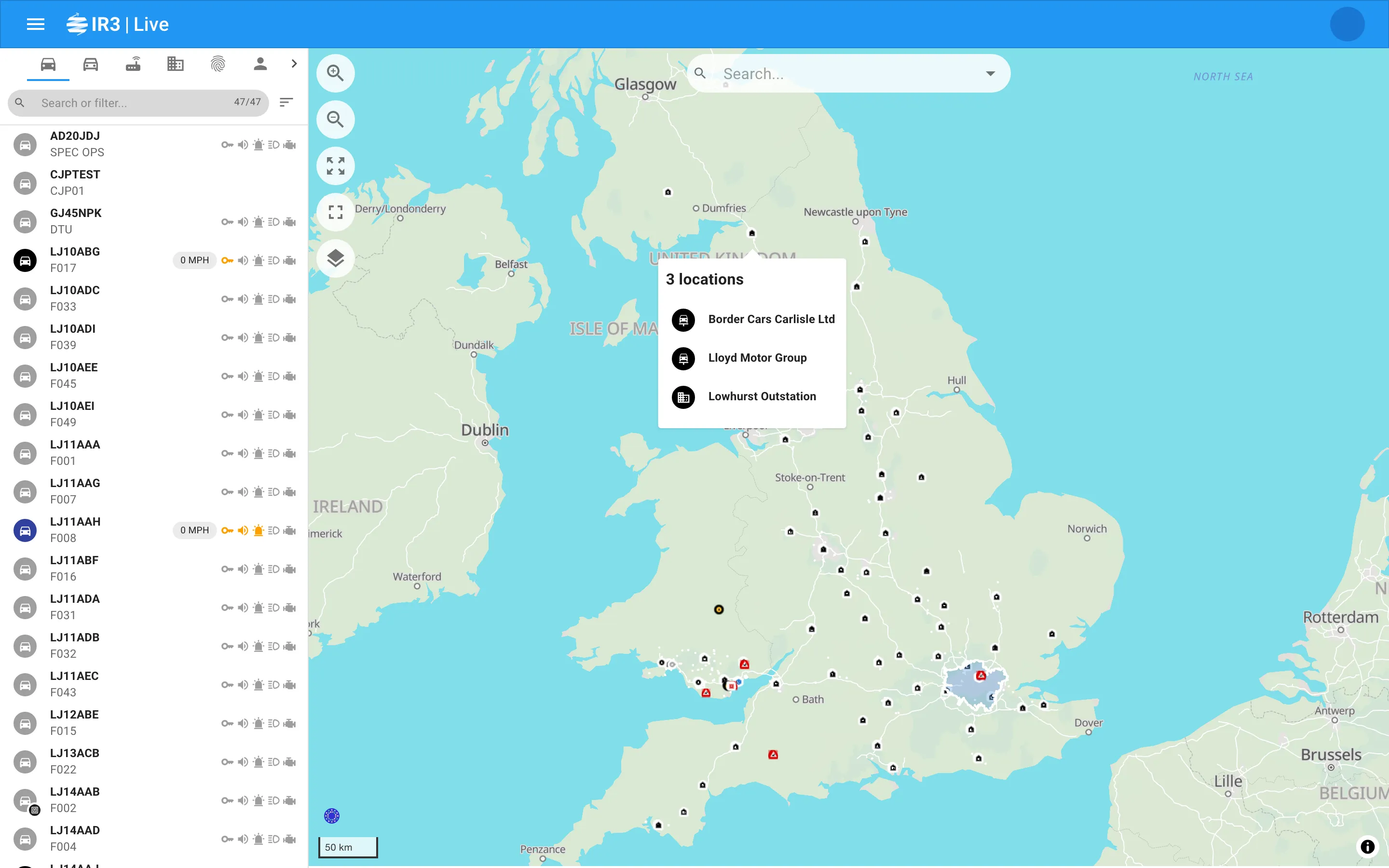
Where icons of the same type would overlap, they’re combined into one group, drawn as a stacked shape. As you zoom in, groups split up once there’s room.
- A group is coloured by its most urgent member, so a group of people with someone in an emergency shows that colour.
- A group of incidents shows their grade if they all share it, or * if they don’t.
Hover over a group to see a popup listing everyone in it, such as “5 vehicles”, with the same rows as the sidebar’s lists. Click a row to open that item. Clicking the group itself doesn’t open anything.
Hover popups
Section titled “Hover popups”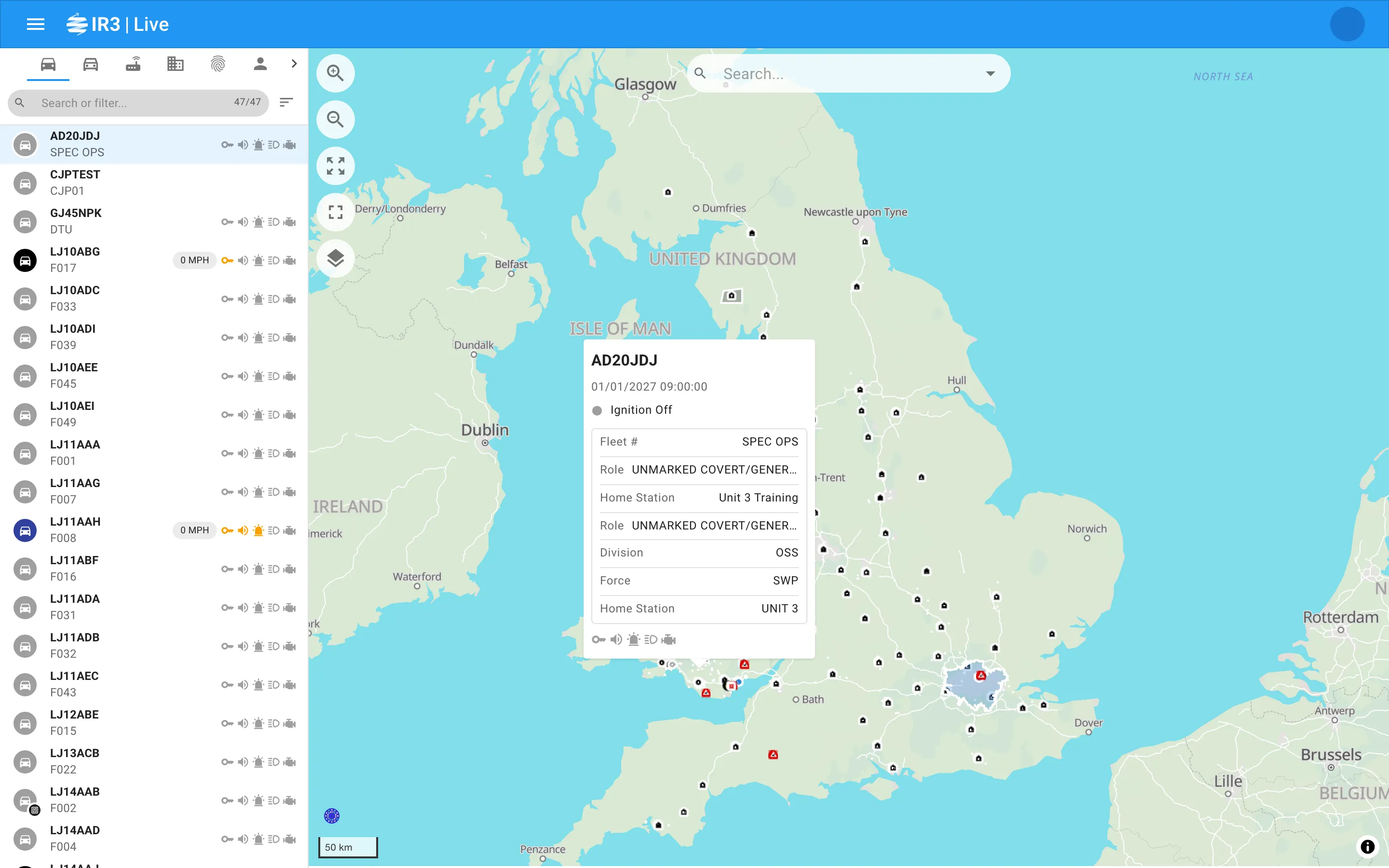
Rest the pointer on an item to see a popup with its main details, such as a vehicle’s driver, an incident’s description or a person’s rank and skills. Hovering over an item’s row in the list opens the same popup on the map.
- The first popup opens after half a second, so moving across the map doesn’t flash popups up.
- While a popup is open, moving to another item switches to it straight away.
- A popup stays for a second and a half after the pointer leaves, so you can move onto it. It stays open while the pointer is over it.
Hovering also highlights the item’s row in the list.
Open an item
Section titled “Open an item”Click an item on the map to open its detail panel. The sidebar also switches to that item’s tab and scrolls its row into view, ready for when you go back to the list.
Click an empty part of the map to close the detail panel and go back to the list.
Map buttons
Section titled “Map buttons”| Button | What it does |
|---|---|
| Zoom in and Zoom out | Zoom the map |
| Fit map | Zoom and pan to fit what you’re looking at (see below) |
| Go full screen | Fill the screen with the map. Click Exit full screen to go back |
| Change map style | Choose a different background map |
There’s also a Search… box at the top of the map for finding places. Type a place and pick a result to move the map there. A scale bar shows distances.
Fit map
Section titled “Fit map”- With an item open, Fit map zooms to that item. For a call sign, it fits the people and vehicles on it.
- With nothing open, it fits everything on the map that isn’t hidden, including faded items while Show filtered out is on.
- If there’s nothing to fit, it tells you so.
Map styles
Section titled “Map styles”Change map style lists the background maps your organisation has set up. IR3 remembers your choice, and the map in each item’s detail panel uses the same style.

IR3 is made by Lightbulb Analytics Ltd. © 2026